Freelancer: PIVNEVA
Share:
Report Entry

By PIVNEVA

And the dark blue version, very serious, but with a little adding of orange gives an impression that the owner of visit card is an artist. Thank you
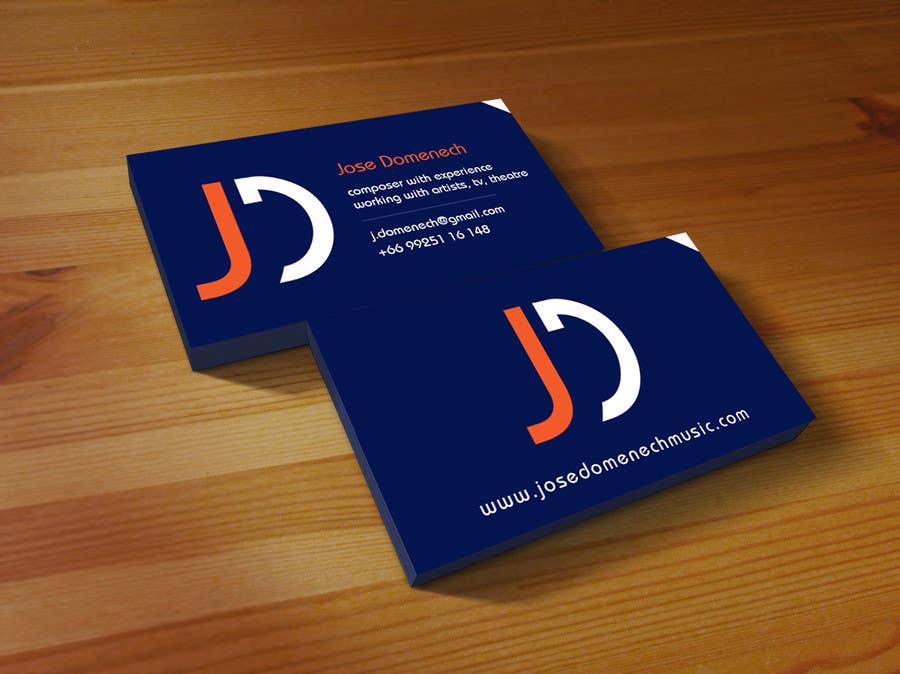
Contest Entry #58 for                                                 Logo Design and Business Card Musician

Public Clarification Board

  • Cinthymex
    Contest Holder
    • 9 years ago

    If this option is chosen, it could ask in these colors you are trying to have different versions? Thank you very much and congratulations on your work

    • 9 years ago
    1. PIVNEVA
      PIVNEVA
      • 9 years ago

      Hello. I will do now changes and if it necessary I can give all variant of my design, not only one. Thank you for your feedback

      • 9 years ago
    2. Cinthymex
      Contest Holder
      • 9 years ago

      Nooo…! backwards, I thank your effort and talent

      • 9 years ago
  • Cinthymex
    Contest Holder
    • 9 years ago

    This is a design that I really like, and now I also really like the card. Only change the following: 1. shape logo: a little wider (especially in the face from behind) 2. face with black background behind the letters of the logo in orange and the other white letters (p web) 3. front face blank background, logo again in orange and other data in black.
    Basically the change would be a little on the distribution of colors. I'm about to take decision. Thank you for everything

    • 9 years ago