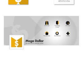
Develop a Corporate Identity for Mega Dollar
- Status: Closed
- Prize: $101
- Entries Received: 43
- Winner: commharm

Contest Brief
--------------------------------------Update---------------------------------------------------------------------
please see attached file.
post your initial logo in black and white only please.
What I have in mind is (referring to the attached image)
1. 2 triangles make the word M (this if only seen by itself can also be recognized as the logo as our identity)
2. text that is similar that makes up the rest of the word mega
3. The word "dollar" that goes with Mega harmoniously
feel free to play around with the text, fonts and typography.
--------------------------------------Orignal---------------------------------------------------------------------
Mega Dollar is a Chain of Dollar Store in Canada.
Our moto is "We work hard to save you money"
I am looking for a Logo Design and Business card (the design will also set the theme of colors for in store signs and displays).
For the logo I am looking for elegance and simplicity. The logo should also reflect our core values, which are excitement, and Providing Value. The logo should reflect that the value of your dollar is more at mega dollar.
Please make sure you also provide a basic flat, monochromatic image of the logo and business card aswell.
Be creative with implementing your own ideas but keep in mind the simpler the better.
Please be mindful when using color and shapes as to what purpose is being served and why you are choosing these certain colors or shapes and how they relate to our values and purpose of our business.
Final Project will require
Copyright release
Logo and busniess card source files, jpg and png.
Thank you.
Recommended Skills
Public Clarification Board
-

Contest Holder - 10 years ago
At this point we are not interested in any new ideas or design if you have not had a 4star design I suggest that you drop this project and not waste your time.
Thank you for all the enteries.
Now
as for those who have the 4 star design are
#80 #86 #79 #52
you all have specific feedback so please work towards polishing and finalizing your designs. So we can move onto color theme and then the business card design.
Thank you.- 10 years ago
View 2 more messages
-
Contest Holder - 10 years ago
Its a good design overall the weak point in design is the "EGA" it doesn't flow with the rest of the image as a whole it seems isolated and alone.
So may be keep an eye on the whole image and overall look, its very easy to get focused on one part of design.
Thanks for an amazing entry- 10 years ago
-

isaviour99
- 10 years ago
how about my entry #40 dan #120 , ... please correction
- 10 years ago
-

jhaypalileo
- 10 years ago
#145
- 10 years ago
-

DerinGFX
- 10 years ago
- 10 years ago
-
DerinGFX
- 10 years ago
Please check #143 thx
- 10 years ago
-
isaviour99
- 10 years ago
how is the rule of this contest? is there any final round for some contestant? thanks..
- 10 years ago
-

premkumar112
- 10 years ago
Hi check my logo design #140 & given the feedback.
- 10 years ago
-

Creart41
- 10 years ago
another design #134
- 10 years ago
-
isaviour99
- 10 years ago
what's the link please..
- 10 years ago
-
Contest Holder - 10 years ago
http://www.freelancer.com/contest/Develop-a-Corporate-Identity-for-Fashion-Store-30665.html
- 10 years ago
-
Creart41
- 10 years ago
some feedback will be great to know the right way to move Forward ! thanks
- 10 years ago
-
Creart41
- 10 years ago
feedback please #126 thanks
- 10 years ago
-

hammad143
- 10 years ago
#123
- 10 years ago
-

ALISHAHID6
- 10 years ago
CHECK #93,#91
- 10 years ago
-
Contest Holder - 10 years ago
Read below please and may be also reread the brief so you don't waste time
Thanks- 10 years ago
-
Contest Holder - 10 years ago
if you are having trouble with typography look here
http://www.smashingmagazine.com/2012/04/13/when-typography-speaks-louder-than-words/- 10 years ago
-
Contest Holder - 10 years ago
idea of the image provided is to take it as a guideline not to just reproduce it as is as #65 personalize make it creative give it your own spin.
not just here we are playing with basic shapes and text.- 10 years ago
-
Contest Holder - 10 years ago
breif updated
please reread..
Thank you.- 10 years ago
-
hammad143
- 10 years ago
#37
- 10 years ago
-
LucaMolteni
- 10 years ago
good morning sir...
so.... we HAVE to use the leaf...? ;-)- 10 years ago
-
Contest Holder - 10 years ago
no leaf is not a must
#20 is quit original, its got personality, its simple, elegant
thats sort of the look we are going for.
lots of people are trying to use the leaf but its not looking good.
the enteries without the leaf are working better.
I would like to see more creative Typographic versions
Just using the text MEGA DOLLAR without any imagery.
Thank you- 10 years ago
-
Contest Holder - 10 years ago
So if you are planing to use the leaf personalize it, give it identity, make it look friendly, welcoming. Samething with the text playing around with spacing shape of each letter instead of adding lines on the top or bottom of the text or adding additional swish etc. to it try to give letter weight or take away making them look and feel unique. (anyone can type mega dollar and choose a different font) its how its space, its weight, how one letter flows into the next letter its relation to the rest of letter and the spacing between the words etc.
Thank you for all the entries.- 10 years ago
-
Contest Holder - 10 years ago
Going through the designs all the designers have had personal feed back.
Anything with 3 stars and up is a good basic design and can be improved upon to become better.
One the essential things that I am seeing in almost all the design is that, they are good basic design and good compositions but the text or the shape is stock. which means is the same stock vector that you see on the web in print and every where else. This is a weak point in the logo and design at large.
cont....- 10 years ago
-

PopaVladDesign
- 10 years ago
Check #29 and tell me what to modify if you are not satisfied abouy my work. (private)
- 10 years ago
-
hammad143
- 10 years ago
#11 any feedback
- 10 years ago
-
Contest Holder - 10 years ago
#2 its out of balance as an entire image and the word mega would be unrecognized in silhouette. Keep in mind we are going for a corporate identity here not children's coloring book cover titles.
Thanks, please try again- 10 years ago
-
Contest Holder - 10 years ago
#1 the gavel and the dollar sign isn't really working, its give more of a legal services vibe, not good.
Try working with the typography. Its not NECESSARY to have the graphic in the logo if its not contributing to the overall logo.
The company moto, doesn't need to be on the logo.
Please read the brief properly and work accordingly to avoid unnecessary revisions.- 10 years ago
-

ameer3366
- 10 years ago
hai
- 10 years ago
How to get started with contests
-

Post Your Contest Quick and easy
-

Get Tons of Entries From around the world
-

Award the best entry Download the files - Easy!