Improve the Design of a wordpress theme for a Music Website
- Status: Closed
- Prize: $100
- Entries Received: 4
- Winner: tunnhn

Contest Brief
I am developing a website of a startup based on a premium wordpress template called Gridstack: (http://themewich.com/gridstack/). Here you can see the website as it is right now: http://bit.ly/1dAGK1t
I would like to make some improvements to this template (specially to the home, the single portfolio page, the pricing page and the sing-up/login form) so to adapt it more to the concept of my site. I
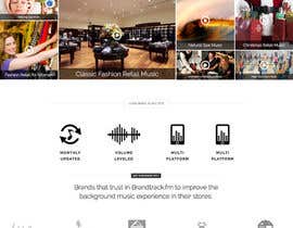
My site is a subscription music platform that offers custom music channels for background music in stores (Restaurants, Retails and Hotels are the target clients). Instead of creating Music Genre Channels, we have developed a different concept of Music channels focused in types of brands and target... For example we have an "International Restaurant music Channel" or a "Fashion Retail for Teen Girls music channel"... and so on.
This site is translatable to 3 different languages (using WPML plugin)... and the subscription process is handled with S2member plugin.
There are three top characteristics that i would like to have in the imrpovements of the site design:
1) ROI Focused (good call to action strategy)
2) Clean and beautiful design
3) Clear Message: The user should understand what the page does in just a second after he arrives.
I expect to recieve good designs ideas (in jpg and psd) on how to improve the design of different areas of the site so to achieve this 3 characteristics.... the special areas i need to improve are:
+ GENERAL: http://www.trackbrand.com.ar
1) The Footer area: I really need to improve this area... its not pretty right now... I will need to add a language switcher there. As I might add many languages... the best would be a dropdown menu.
+ HOMEPAGE: http://www.trackbrand.com.ar
1) The introductory Text with a call to action button so the user register to try the site for free during 30 days.
2) The Portfolio Gallery of the home: Here i need many changes... for example... the template doesn´t come with the name of the portfolios by default... you need to mouse over to know what is the title of every portfolio and in my case this is not good... and also a play icon in the middle of every music channel thumbnail will help to let users understand that this is a music website. I have given just ideas... I am sure you can give me better ones! I have also changed the original template to achievet this... but if you find a better way to show it... perfect!
3) The clients Logos showcase
4) A Features section so to show the top 3 features of the site
5) A nice ending for the home (maybe with an image as is right now or whatever you think it could be added)
+ SINGLE PORTFOLIO (That will be the single page for every music channel): http://trackbrand.com.ar/music/modern-hotel/
I would like to have a "music app" oriented design here. Many users will come from an organic search from Google that have never visited my site and I would like to impress the user with the beauty of the site and also introduce what my site does in the first view of the page (without scrolling).
1) The music player UI (just need a play, a stop button and the volume)
2) A space for a nice image (it can be in any place... its not mandatory to add it inmediately after the player... it can be outside the first screen).
3) More info about the Channel
4) A space to request changes or another channel
5) A nice "Back to Channels Panel" button.
6) A flexible sidebar or some space to show a thumbnail of the different channel categories
+ PRICING: http://trackbrand.com.ar/plans-pricing/
Here is a link of the site right now: http://bit.ly/1dAGK1t ... but as I am a little bit stuck... I came to Freelancer so to hire someone that can give me best ideas on how to improve the site and launch good. My idea is to continue hiring for further improvements to the best designers.
Please feel free to ask!
Recommended Skills
Employer Feedback
“after I hire him... he just simply dissapear and do not continue talking to me. Very Weird. Be careful.”
![]() juampolo, Spain.
juampolo, Spain.
Public Clarification Board
How to get started with contests
-

Post Your Contest Quick and easy
-

Get Tons of Entries From around the world
-

Award the best entry Download the files - Easy!