Logo Design - Quick and east job - UGENT

  • Status: Closed
  • Prize: £100
  • Entries Received: 2

Contest Brief

Hello,

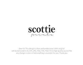
Here is our logo: http://www.scottieprints.com

We would like it improved;

- Cleaner
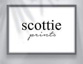
- All Black or Black and Grey
- Show me it on a White and Black background please
- We would like similar fonts
- Similar style

THE GOAL: To make the connection between the two words ''scottie'' and ''prints'' more simple and clean.

What we don't like: the connection between the two words. We would like it to look more natural - somehow.

HOW?

By changing the layout or fonts.

Thanks and good luck!

Recommended Skills

Top entries from this contest

View More Entries

Public Clarification Board

  • jitusarker272
    jitusarker272
    • 4 years ago

    https://gyazo.com/24e0f19645c8155c18ef1b11c7a72b56 cheak this

    • 4 years ago
  • jitusarker272
    jitusarker272
    • 4 years ago

    https://gyazo.com/7483d5be52f936612f4fe2c3756d9ea8 sir cheak this entry

    • 4 years ago
  • nhussain7024
    nhussain7024
    • 4 years ago

    Hello Ch,please check my entries and rate.thanks

    • 4 years ago
  • nhussain7024
    nhussain7024
    • 4 years ago

    Sir, Kindly check my entries and rate.thanks

    • 4 years ago
  • arifin1234
    arifin1234
    • 4 years ago

    #1013

    • 4 years ago
  • ProPopTop
    ProPopTop
    • 4 years ago

    Dear CH, please check my entries #1113 #1114

    • 4 years ago
  • snshanto999
    snshanto999
    • 4 years ago

    Sir Please check #1110#1111

    • 4 years ago
  • sohan010
    sohan010
    • 4 years ago

    Please check #1089

    • 4 years ago
  • MOU0
    MOU0
    • 4 years ago

    Please check #1064 sir.

    • 4 years ago
  • mousumi23
    mousumi23
    • 4 years ago

    Please check#1060

    • 4 years ago
  • Ripon8606
    Ripon8606
    • 4 years ago

    Please check #1037 #1038

    • 4 years ago
  • alimon2016
    alimon2016
    • 4 years ago

    Please check my logo design free fonts use work well. i am waiting for your feedback #983 , #984 , #985

    • 4 years ago
  • abdouzaidi
    abdouzaidi
    • 4 years ago

    Please check #1002

    • 4 years ago
  • abdouzaidi
    abdouzaidi
    • 4 years ago

    Please check #1001

    • 4 years ago
  • abdouzaidi
    abdouzaidi
    • 4 years ago

    Please check #1000

    • 4 years ago
  • Haidderr
    Haidderr
    • 4 years ago

    Please check #971 #972 & I'm sure you won't regret after seeing those designs.
    Thanks!

    • 4 years ago
  • graphicsneeded10
    Contest Holder
    • 4 years ago

    Hello everyone, the logo we like the best has been uploaded to our website: www.scottieprints.com. Please check the logo and do your best to improve it! Please read the updated contest description. The price will also be increased soon! No old entries will be considered - thank you and good luck!

    • 4 years ago
    1. waleedahmeddkjl
      waleedahmeddkjl
      • 4 years ago

      Hi sir what do you want? Please let me know waiting for feedback now

      • 4 years ago
    2. margipansiniya
      margipansiniya
      • 4 years ago

      Please check #970

      • 4 years ago
  • MDAzimul
    MDAzimul
    • 4 years ago

    hope you like my design.

    • 4 years ago
  • MDAzimul
    MDAzimul
    • 4 years ago

    Hello sir, please check my update design #942 and #943.

    • 4 years ago
  • classydesignbd
    classydesignbd
    • 4 years ago

    Please check my entry #890 #891 #892 #893 #894 #895 #896

    • 4 years ago
  • incoronatapirci
    incoronatapirci
    • 4 years ago

    Please check entry #847. Thank you

    • 4 years ago
  • incoronatapirci
    incoronatapirci
    • 4 years ago

    What do you mean with "connection"? Obviously you are no looking for a joining between the two words. So, It's hard to understand what are you looking for.

    • 4 years ago
    1. graphicsneeded10
      Contest Holder
      • 4 years ago

      Hey Inco, thank you for your question. What I mean is, on the current logo the two words don't seem to work very well together, for whatever reason. Maybe the styles are too different? Maybe the arrangement of the two words? I don't know, but right now I feel like I'm looking at two separate words instead of one clean logo.

      • 4 years ago
  • Tahmim
    Tahmim
    • 4 years ago

    check #759 thank you

    • 4 years ago
  • marashel95
    marashel95
    • 4 years ago

    Please check #730 #735

    • 4 years ago
  • creativeboss92
    creativeboss92
    • 4 years ago

    hello sir please check this our entry and rejected and rating our entry

    • 4 years ago
  • jominhossain01
    jominhossain01
    • 4 years ago

    thanks, sir for your valuable feedback. Working on it.

    • 4 years ago

Show more comments

How to get started with contests

  • Post your contest

    Post Your Contest Quick and easy

  • Get tons of entries

    Get Tons of Entries From around the world

  • Award the best entry

    Award the best entry Download the files - Easy!

Post a Contest Now or Join us Today!