Restyle a Logo
- Status: Closed
- Prize: €150
- Entries Received: 37
- Winner: zochav

Contest Brief
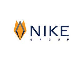
The Task is to RESTYLE the logo of a company called Nike Consulting. Nike Consulting is a 20-year-old company based in Milan, Italy and its clientele is familiar with the company’s corporate identity. (www.nikeconsulting.it)
The name of the company is changing from NIKE Consulting to NIKE Group and this explains our logo restyling effort, however please do not modify the logo based on this concept of "many to one". This is not a theme that we wish to express in the new logo. The text in the logo created has to read: NIKE Group
Creative fact: The original concept of the logo was derived from the Greek winged Goddess of victory; however, the logo is viewed by most as a tulip! There is no actual connection with the company, or the origin, it is just a coincidence that people see the logo as a tulip. You may bear this in mind while thinking of a design.
It is important to keep the logo Recognizable. Refreshing and restyling is the key aim, but revolutionizing the logo is not our aim.
Please try to express a fresh approach to the redesign process, bearing in mind a key word: VISUAL IMPACT!
Rules of the game:
Colour code: To be kept the same
Blue, R:0 G:34 B:76
Orange, R:255 G:153 B:0
Grey, R:102 G:111 B:116
Font: Changes to Font are acceptable, however unnecessary
The person who is assigned the logo design task will be given further work to produce our corporate identity documents, if willing to take up the task.
Recommended Skills
Public Clarification Board
-

Contest Holder - 7 years ago
Thanking Everybody for their work. Best of luck. We chose a winner today. Zochav.
- 7 years ago
-
Contest Holder - 7 years ago
We shall be deciding the winner by Next Friday. Thanking everyone for efforts and the work showcased.
- 7 years ago
-

dsignxperts
- 7 years ago
please check #512 #513 #514 #516
- 7 years ago
-

Balghari91
- 7 years ago
Yes sir, It becomes hard to choose one from many options rather than from few options. So we are waiting see who would be the luckiest one of this contest.
I hope you would be considering #513.- 7 years ago
-

gauravparjapati
- 7 years ago
check #487
- 7 years ago
-

eddy82
- 7 years ago
Please check #508 #509 ... thanks..
- 7 years ago
-

Design Point
- 7 years ago
#524 #525 #526
- 7 years ago
-

alexandersazon
- 7 years ago
Please check #518 #519. Thanks.
- 7 years ago
-
alexandersazon
- 7 years ago
#520. Thanks.
- 7 years ago
-
alexandersazon
- 7 years ago
#521. Thanks.
- 7 years ago
-
Balghari91
- 7 years ago
check #513 please. thanks
- 7 years ago
-

dawntodask
- 7 years ago
plz check #511
- 7 years ago
-

dkdesign8449
- 7 years ago
#506 #507 THANKS
- 7 years ago
-
gauravparjapati
- 7 years ago
please check #487
- 7 years ago
-
gauravparjapati
- 7 years ago
please check #485 #486
- 7 years ago
-
gauravparjapati
- 7 years ago
please check #484
- 7 years ago
-

parththakur
- 7 years ago
SIR PLZ CHECK #480 #481 #482 #483
- 7 years ago
-
dkdesign8449
- 7 years ago
#472
- 7 years ago
-
dkdesign8449
- 7 years ago
check #469 #470 #471 thanks
- 7 years ago
-

fifiyustika06
- 7 years ago
Entry #465 i hope you like it sir thanks
- 7 years ago
-

bluebellgraphic
- 7 years ago
Kindly check #462 #463 #464
Thanks- 7 years ago
-

RamSTR
- 7 years ago
please check Entry #461
- 7 years ago
-

stefansimic91
- 7 years ago
entry #444
- 7 years ago
-

kausar999
- 7 years ago
but why
- 7 years ago
-
Contest Holder - 7 years ago
hello, have provided justifaction over mesaage on your pm
- 7 years ago
-
Contest Holder - 7 years ago
Dear All. It seems that all are producing the Same font for the naming NIKE COnsulting. It all looks rather sporty to us. The Logo is not for a sporting company. Its for a consultancy company and we do not do social media or sell goods. We are a services company with a specialized sector and we need the logo to be sleek, More financial. Seriousness is a key feature of our logo. Could you please try to follow this guideline too. thanks to everybody for the great work proposals you are sending us.
- 7 years ago
View 1 more message
-

wastidesign786
- 7 years ago
please check#428 thanks sir
- 7 years ago
-

genghiss
- 7 years ago
please check #414 #415 and feedback...
- 7 years ago
-
parththakur
- 7 years ago
SIR PLZ CHECK #390 #391 #392 #393
- 7 years ago
-
parththakur
- 7 years ago
sir plz check #380 #381 #382 #383
- 7 years ago
-

vishallike
- 7 years ago
Kindly check #366
- 7 years ago
-

Designgot
- 7 years ago
Please Check #313 #314 #318 #344 #345 #346 #347 Thank You
- 7 years ago
-
Designgot
- 7 years ago
#348 #349
- 7 years ago
-

azhanmalik360
- 7 years ago
#343
- 7 years ago
-
azhanmalik360
- 7 years ago
#340
- 7 years ago
-

stark1992
- 7 years ago
feedback pls.
- 7 years ago
-
parththakur
- 7 years ago
sir plz check #333 #334
- 7 years ago
-
vishallike
- 7 years ago
Kindly check #309 #310 #311 :-)
- 7 years ago
-
vishallike
- 7 years ago
Sir PLease check #307 :-)
- 7 years ago
-
parththakur
- 7 years ago
sir plz check #305
- 7 years ago
-
parththakur
- 7 years ago
sir plz check #303
- 7 years ago
-
parththakur
- 7 years ago
sir plz check #298
- 7 years ago
-
parththakur
- 7 years ago
SIR PLZ CHECK #287 #288 #289 #290 #291
- 7 years ago
-
parththakur
- 7 years ago
sir plz check #278 #279 #280 #281
- 7 years ago
-
parththakur
- 7 years ago
sir plz check #271 #272 #273 #274 #275 #276 #277
- 7 years ago
-
Balghari91
- 7 years ago
The instructions were to keep the designs closest or at least close to the previous logo but CH rated highest to those which went farthest from the old one. Amazing.
- 7 years ago
-
Contest Holder - 7 years ago
Hi there, trust the writer, we are trying our best and have reviewed all the options one by one. One might consider that we rated those furthest.. it is a common fact that in creative work there can be discrepencies between brief and final choice. We are Human afterall....As of this moment, the 5 star rated entries are considered as PRESENTATIONS WORTH considering ... other unmarked or deleted options might be fished up towards the end. We did not want a complete restyling, in fact we keeping the writing, the lettering intact. (visible in the 5 star submissions) Change is good, especially when influenced by creativity. Thanking everybody for their submissions
- 7 years ago
-
parththakur
- 7 years ago
sir plz check #265 #266
- 7 years ago
How to get started with contests
-

Post Your Contest Quick and easy
-

Get Tons of Entries From around the world
-

Award the best entry Download the files - Easy!