mashudurrelative
Bangladesh

Hello Hello
We've reached our 10 Year Anniversary since starting our company back in 2010. It's been a rough year for every business, but we came out swinging. What better way to roll back into the market than with a fresh new look. But don't go crazy because we're not looking for a total logo change. Just a enhancement.
Simpurgo Building Maintenance is a janitorial company servicing all of Western Canada. Started from a single client and now cleaning over 10 million sqft per day with over 300 team members. You can visit our website to learn more about our company www.simpurgo.com
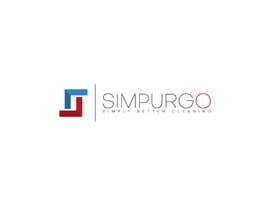
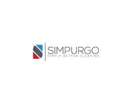
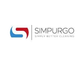
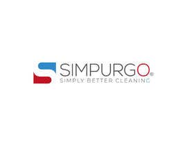
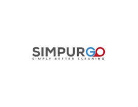
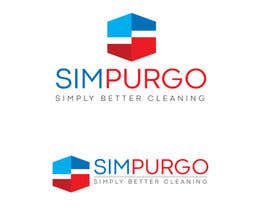
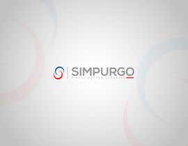
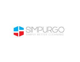
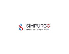
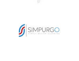
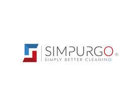
Our current logo is clean and simple, something we'd like to keep. Keep the blue and red, it's something we're known by, but we'd be open to see other shades of blue/red. One thing that must be changed is the font. We're looking for something thin, clean and modern. The current shape of the logo represents the "S" but also the buildings we service.
Simpurgo derives from the Latin word Purgo and our slogan "Simply better cleaning". Sim-Purgo
We're launching our new website in the coming weeks. It would be a great addition to fall in love with a new logo to add into the rollout.
Best of luck!
“Great work! Did exactly what we needed.”
![]() RoselleCorp, Canada.
RoselleCorp, Canada.


Post Your Contest Quick and easy

Get Tons of Entries From around the world

Award the best entry Download the files - Easy!

